
OVERVIEW
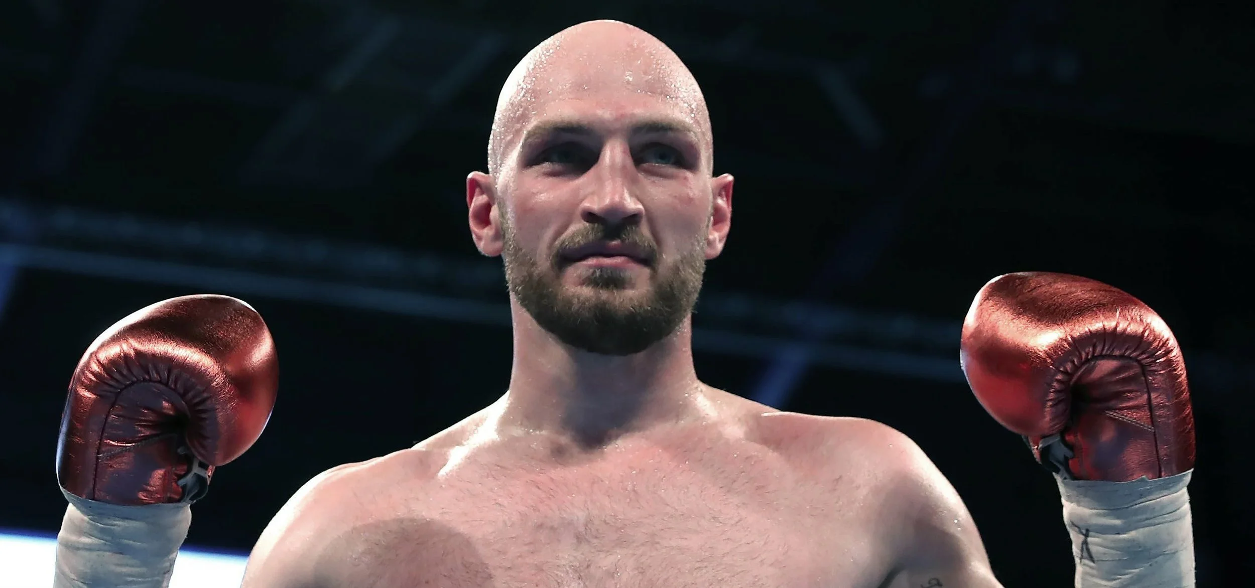
Steve Ward is a Belfast boxer with ambitions to reach the very top of the sport. We were challenged to create a brand that would help him reach a wider audience and draw in more sponsorship. The world of boxing has become much noisier and bolder. Bravado and swagger dominate the sport. Steve doesn’t fit this mould, in fact he is known as ‘The Quiet Man’. So, in a world of noise, can we say more by speaking less?
PRODUCTION
Creative Partner:
Ringers
ROLE
Design Direction


Having spent time with Steve, we began to build up a better understanding of his character both inside and outside of the ring. When developing his brandmark we wanted to ensure we represented all elements of his personality:
STENCIL We started with a stencil typeface - something that is both minimal and bold. It uses only what it needs to be understood, much like Steve.
SERIF Steve happily admits to be a traditional person. He would consider himself almost old-fashioned. We took elements of classic serif fonts to represent this.
GRIT He isn’t afraid to get his hands dirty. He has a determination that sets him apart from the competition, so we new we needed a touch of ruggedness within the design.


We spent time with Steve and his family to create our short films.
